MyFonts Beta is Looking Good
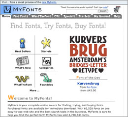
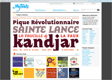
I got a pleasant surprise when I went to MyFonts.com a couple of days ago and saw the new sneak peak at the beta version redesign. What I once thought was my little secret will now be completely out of the bag. No longer will other designers be put off by the almost amateurish appearance of the old site this is replacing. MyFonts was one of those sites whose functionality more than made up for its lack of design sophistication. But I always felt if there was any site that deserved a better site design, MyFonts was it. And now it has one. And it is several orders of magnitude in both the design as well as the functionality.
One of the features I loved was the ability to save your own albums of font designs with various text samples. The old site was frustrating in that you had to go through a rather convoluted and hidden series of pages to even view your own albums let alone set a new one up. And then, when you wanted to add a font to an album, it would only let you add it to the “selected” album. You’d have to go back to your album page and change the selection. Now you have the ability to add to any previous album and even better, you can also create them much quicker without having to go through the old maze. You can do it from any font sample now with a very slick AJAX interface.
Another great feature that has been beefed up is the “WhatTheFont” feature. This is a great tool to identify an obscure typeface that you need to match. I have had good success with the old version but am even more impressed with the updated feature. You can either upload a graphic or point it to a URL of an image and it will then process the image and try to break it down into separate characters (which can be tricky for hand-written script style fonts) and then shows you what it thought was the best letter choice for each shape. Then you can enter in the correct character if there is any that are mismatched. It will then go through its database of fonts and show you a list of potential matches. In the new version, your original characters that you uploaded will stay stationary on the right as you scroll down through the list, so you always have a visual to compare the suggested fonts to. Very slick and very effective.
 And then finally, is the overall design. I hate to rag on others’ designs in public, but the old design was not even good for 1998. It just never looked like it was designed by someone who truly appreciated fonts. But, it was mostly functional if you were willing to poke through all the navigation that was needed to enjoy its features. The functional reward definitely outweighed the negative of the design. And like I hinted at earlier, I actually looked at it for a long time as a designer’s advantage because I was hoping that others would be put off by the design and not realize what a great site it was and thereby giving me some sort of creative advantage. Shame on me, I know. But the new design more than atones for the old site’s aesthetic transgressions.
With all that said, not everyone is happy with the changes as is evidenced by some of the comments on the Feedback forum but I know from experience that will always be the price of moving forward. I’m trusting that the MyFonts team is listening to the criticisms with a grain of salt. I want to encourage the team to a job well done and wish them success in ironing out any final issues and getting the new design live. Kudos MyFonts! Would love to hear more about the process involved.


[…] Vote MyFonts Beta is Looking Good […]