Eternal Design Verities
Filed under: "Whitestone Design Werks", Design, Identity, Logo Design
As a designer who finds much satisfaction in seeing a design I created implemented in a broad-reaching way, we (at least I do) tend to think of a successful identity design as a grasp at immortality–if even on a small scale. But the truth is, that even vaunted design systems by the masters of the craft are remapped and redrawn as time marches on and our grip on the immortal (which was an illusion to begin with) begins to slip. As eternal verities go, there is only one logo that will stand forever, and that is the Logos Himself. It is good to have a right perspective of our place in the eternal scheme of things. The best that we might hope for design-wise, is that like Saul, we might sever the silver cord before our work is re-imagined by a bunch of snot-faced little brats that are still in diapers.
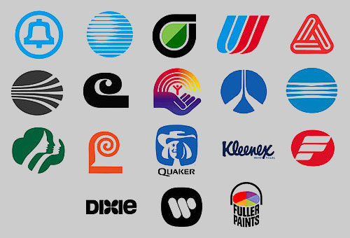
This post is actually based on a comment I was going to post on a good article (if incomplete on the eulogies) called Love Thy Logo by Bill Gardner at RockPaperInk. In the article Bill offers his thoughts about the post-mortem redesigns of the iconic works of the immortal Saul Bass. Since I don’t much like using Facebook-powered comment fields very much, I opted to just post in my own blog instead (which doesn’t use FB comments) thank you very much.
Since I don’t expect everyone who visits my blog to know who Saul Bass was, if the collection of logos above doesn’t give you an idea, or if you’d like to learn more, then some good jumping-point pages to learn more about Saul and his design influence are here, here and here.


Well said. Thanks for your good thoughts.