Solution For Confusing Names In Car Insurance: AllStateFarmers!
Filed under: "Whitestone Design Werks", Design, Identity, Logo Design
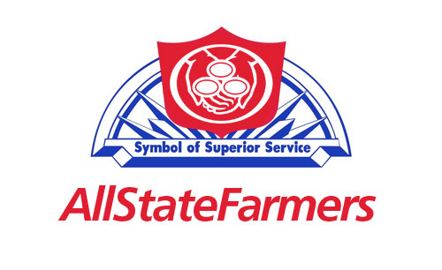
Quick! Who’s your car insurance carrier?! Just thought I would submit a solution to help cement any ongoing confusion you might be having regarding what car insurance brand you currently carry. Probably one of the good reasons GEICO stands out from the crowd. You know if you have GEICO. Allstate? State Farm? Farmers? Not so much.
Eternal Design Verities
Filed under: "Whitestone Design Werks", Design, Identity, Logo Design
As a designer who finds much satisfaction in seeing a design I created implemented in a broad-reaching way, we (at least I do) tend to think of a successful identity design as a grasp at immortality–if even on a small scale. But the truth is, that even vaunted design systems by the masters of the craft are remapped and redrawn as time marches on and our grip on the immortal (which was an illusion to begin with) begins to slip. As eternal verities go, there is only one logo that will stand forever, and that is the Logos Himself. It is good to have a right perspective of our place in the eternal scheme of things. The best that we might hope for design-wise, is that like Saul, we might sever the silver cord before our work is re-imagined by a bunch of snot-faced little brats that are still in diapers.
This post is actually based on a comment I was going to post on a good article (if incomplete on the eulogies) called Love Thy Logo by Bill Gardner at RockPaperInk. In the article Bill offers his thoughts about the post-mortem redesigns of the iconic works of the immortal Saul Bass. Since I don’t much like using Facebook-powered comment fields very much, I opted to just post in my own blog instead (which doesn’t use FB comments) thank you very much.
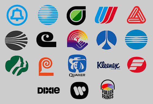
Since I don’t expect everyone who visits my blog to know who Saul Bass was, if the collection of logos above doesn’t give you an idea, or if you’d like to learn more, then some good jumping-point pages to learn more about Saul and his design influence are here, here and here.
JEB Commerce Identity Design and Rebrand Complete
Filed under: "Whitestone Design Werks", Coeur d'Alene, Design, Identity, Logo Design, North Idaho
We’ve been applying the finishing touches on a branding overhaul that Whitestone Design Werks created for JEB Commerce which we announced last September. In that post, our intent (both JEB Commerce and WDW) was to highlight the whole process step by step for the benefit of other businesses considering what it would take to re-invent their identity and infuse their brand with a new fresh, life. Well, the best-laid plans of mice and men…
As a consolation, we are now providing highlights of the new identity system and how it has been applied across the board to all of the collateral pieces needed for conducting a successful business. After showing what was originally being used by JEB Commerce after the jump, we’ll show the new identity living and breathing in all of it’s new environments.
Announcing VINeleven at the Napa Valley Marriott
Filed under: "Whitestone Design Werks", Design, Identity, Logo Design
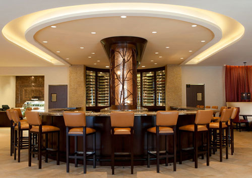
I’m very excited to see the launch of The Napa Valley Marriott’s redesigned lobby and restaurant that they have name VINeleven next week. Whitestone Design Werks is proud to have been chosen to design the new identity that will be used throughout the hotel and restaurant. Their official “Release Party” is an invite affair to be held on Friday, May 6.
Looking forward to getting down there and will posts pics of the logo in the live environment along with a little bit of the story behind the design.
If you get a chance to visit Napa Valley soon, be sure to drop in and enjoy a taste of the fruits of Napa Valley.
My Take On Starbucks Logo Evolution
Filed under: "Whitestone Design Werks", Design, Identity, Logo Design
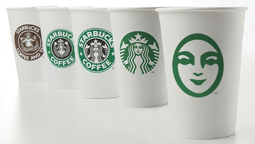
In light of Starbucks choosing to update their logo on their cups for their 40th anniversary by streamlining and isolating the mark and ditching the name to join the ranks of iconic brands Nike and Apple. Rather than get angry, I thought I would give it my (tongue firmly in cheek) take on what I think would be the next logical evolution of the iconic brandmark.

Original image from Starbucks
My take on the change as a designer, I think I would have explored a containing ring around the mark, and maybe even tried experimenting with size and orientation (which I would assume was part of their internal process), but I take my hat off to them for making a gutsy decision to take the next step and elevate the brand above being just about “coffee”. I think that removing the concentric ring, takes it out of the crest-style and negates the need to let it stand in isolation. I think they could have had a little more fun with it. But I also understand their desire to not mess too much more with the equity in the existing imagery. Would love to see the stages of exploration that they went through to arrive at their final design.
Fellow designers, don’t be too critical of my execution, this was just meant to be a quick, five-minute diversion that like all jobs that take three times longer than planned, turned out to take 15 minutes. So, there are nuances of curves that I would normally take more pains to smooth, etc. Also, the fact that by focusing on just the face, I realize that several other key elements to establishing the iconography are missing, notably the star-crown, hair and mermaidish apparitions of the siren. In hindsight, and if I had the time to indulge, I would have added at least two other steps in the evolutionary chain showing a more gradual reduction. The goal here was getting it to it’s minimal essence—actually, more like past it.
I think I’ll go put another pot of coffee on. And, get back to werk.
