Solution For Confusing Names In Car Insurance: AllStateFarmers!
Filed under: "Whitestone Design Werks", Design, Identity, Logo Design
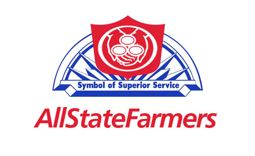
Quick! Who’s your car insurance carrier?! Just thought I would submit a solution to help cement any ongoing confusion you might be having regarding what car insurance brand you currently carry. Probably one of the good reasons GEICO stands out from the crowd. You know if you have GEICO. Allstate? State Farm? Farmers? Not so much.
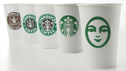
My Take On Starbucks Logo Evolution
Filed under: "Whitestone Design Werks", Design, Identity, Logo Design
In light of Starbucks choosing to update their logo on their cups for their 40th anniversary by streamlining and isolating the mark and ditching the name to join the ranks of iconic brands Nike and Apple. Rather than get angry, I thought I would give it my (tongue firmly in cheek) take on what I think would be the next logical evolution of the iconic brandmark.
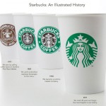
Original image from Starbucks
My take on the change as a designer, I think I would have explored a containing ring around the mark, and maybe even tried experimenting with size and orientation (which I would assume was part of their internal process), but I take my hat off to them for making a gutsy decision to take the next step and elevate the brand above being just about “coffee”. I think that removing the concentric ring, takes it out of the crest-style and negates the need to let it stand in isolation. I think they could have had a little more fun with it. But I also understand their desire to not mess too much more with the equity in the existing imagery. Would love to see the stages of exploration that they went through to arrive at their final design.
Fellow designers, don’t be too critical of my execution, this was just meant to be a quick, five-minute diversion that like all jobs that take three times longer than planned, turned out to take 15 minutes. So, there are nuances of curves that I would normally take more pains to smooth, etc. Also, the fact that by focusing on just the face, I realize that several other key elements to establishing the iconography are missing, notably the star-crown, hair and mermaidish apparitions of the siren. In hindsight, and if I had the time to indulge, I would have added at least two other steps in the evolutionary chain showing a more gradual reduction. The goal here was getting it to it’s minimal essence—actually, more like past it.
I think I’ll go put another pot of coffee on. And, get back to werk.
JEB Commerce Upcoming Identity Design – Not Just a Logo
Filed under: "Whitestone Design Werks", Design, Identity, Logo Design, North Idaho
After experiencing tremendous growth and unparalleled success as a dynamic start-up in the affiliate marketing management industry, JEB Commerce – Affiliate Program Manangement realized their logo, while professional looking, was more fitting for a business in its infancy than the maturing powerhouse it was becoming and the respected leader in their industry they were aiming to attain. Even as a relatively new player, they had already amassed an impressive client list that included brands like: Elance, Ligonier Ministries, philosphy, OfficeFrog to name just a few as well as successful experience working with brands such as Dean & Deluca and Zappos.com.
After trying an online crowd-sourcing logo design solution and being less-than-impressed with the submissions, JEB Commerce decided to approach Whitestone Design Werks to come up with a design for a new logo in order to refresh and reposition their brand. What Jamie Birch, owner of JEB Commerce thought was a simple request to design a logo, turned into an education about the difference between “just a logo” and what a well-thought out and designed identity system was and how it was crucial for developing JEB Commerce’s position as not just a well-respected brand but an authoritative, leading brand in their space.
Random Razor Rant: I Need More Blades In My Razor
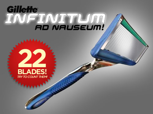
I finally caved in and bought a Gillette Fusion 5-blade razor last week. I’ve been using an old Mach 3 for I’ve lost track of how long (at least 15 years!). I’ve been in rebellion against the ridiculously high prices of razors and typically overuse my razors until they start to feel like flesh-ripping weasels. Then I head off to Costco and marvel at the insane thought of paying over $40 for a bazillion-pack of razors and chicken out and go to local supermarket or Target and get a 4-pack for the ridiculous price of $9+. My rebellion may have backfired last week in that I was looking for the cheapest option of blades but let the seductive siren-song of a 5-blade Gillette Fusion tempt me and I determined to get out as cheaply as possible (buying price–not per unit price) and I bought the slick new new razor handle along with two new blades on sale for only $6!
Left Field: Apple HDTV?
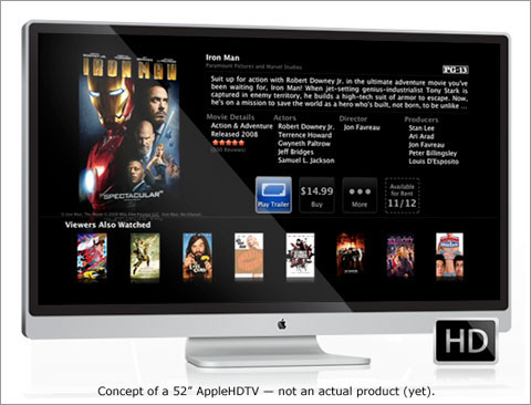 To see the Apple logo emblazoned, front and center, in the living room on a 50″-ish HDTV and not just tucked away on the desk in the office or bedroom or den, but where everyone lives–what a branding opportunity. Not that Apple has ever created a product just for the sake of brand-building, but if there was ever the perfect blending of meeting a need in an arena where brands are defined like no other, creating an HDTV that wirelessly ties into the iTunes store and runs Front Row so brain-dead simple and right out of the box, this would be it. If Jason Calacanis from Valleywag is correct as reported in Nate Lanxon’s blog on CNET UK, which I originally found the link on TUAW’s Rumor Roundup) (link-love spread around), it might finally be taking shape in Cupertino and even more importantly, close to being released to the public.
