Eternal Design Verities
Filed under: "Whitestone Design Werks", Design, Identity, Logo Design

As a designer who finds much satisfaction in seeing a design I created implemented in a broad-reaching way, we (at least I do) tend to think of a successful identity design as a grasp at immortality–if even on a small scale. But the truth is, that even vaunted design systems by the masters of the craft are remapped and redrawn as time marches on and our grip on the immortal (which was an illusion to begin with) begins to slip. As eternal verities go, there is only one logo that will stand forever, and that is the Logos Himself. It is good to have a right perspective of our place in the eternal scheme of things. The best that we might hope for design-wise, is that like Saul, we might sever the silver cord before our work is re-imagined by a bunch of snot-faced little brats that are still in diapers.
This post is actually based on a comment I was going to post on a good article (if incomplete on the eulogies) called Love Thy Logo by Bill Gardner at RockPaperInk. In the article Bill offers his thoughts about the post-mortem redesigns of the iconic works of the immortal Saul Bass. Since I don’t much like using Facebook-powered comment fields very much, I opted to just post in my own blog instead (which doesn’t use FB comments) thank you very much.
Since I don’t expect everyone who visits my blog to know who Saul Bass was, if the collection of logos above doesn’t give you an idea, or if you’d like to learn more, then some good jumping-point pages to learn more about Saul and his design influence are here, here and here.
My Take On Starbucks Logo Evolution
Filed under: "Whitestone Design Werks", Design, Identity, Logo Design

In light of Starbucks choosing to update their logo on their cups for their 40th anniversary by streamlining and isolating the mark and ditching the name to join the ranks of iconic brands Nike and Apple. Rather than get angry, I thought I would give it my (tongue firmly in cheek) take on what I think would be the next logical evolution of the iconic brandmark.

Original image from Starbucks
My take on the change as a designer, I think I would have explored a containing ring around the mark, and maybe even tried experimenting with size and orientation (which I would assume was part of their internal process), but I take my hat off to them for making a gutsy decision to take the next step and elevate the brand above being just about “coffee”. I think that removing the concentric ring, takes it out of the crest-style and negates the need to let it stand in isolation. I think they could have had a little more fun with it. But I also understand their desire to not mess too much more with the equity in the existing imagery. Would love to see the stages of exploration that they went through to arrive at their final design.

My take on adding concentric ring outside logo. Just had to see what it would look like
Fellow designers, don’t be too critical of my execution, this was just meant to be a quick, five-minute diversion that like all jobs that take three times longer than planned, turned out to take 15 minutes. So, there are nuances of curves that I would normally take more pains to smooth, etc. Also, the fact that by focusing on just the face, I realize that several other key elements to establishing the iconography are missing, notably the star-crown, hair and mermaidish apparitions of the siren. In hindsight, and if I had the time to indulge, I would have added at least two other steps in the evolutionary chain showing a more gradual reduction. The goal here was getting it to it’s minimal essence—actually, more like past it.
I think I’ll go put another pot of coffee on. And, get back to werk.
Trademark Infringement of Mascot Logo! Texas High School Gets Mauled by Penn State
Filed under: "Whitestone Design Werks", Design, Identity, Logo Design
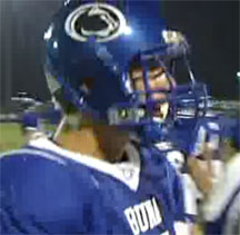
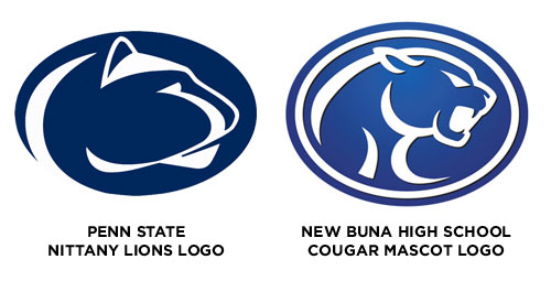
Buna H.S. infringing on Penn State Nittany Lions logo on their helmets
Like many high schools with little budget and no clue as to what institutes true trademark infringement, Buna High School in Buna, Texas had been “assured” by a local sportswear vendor that using this cool cougar image would be perfect and different enough than Penn State’s Nittany Lion logo that they would be safe in using it. Not sure what alternate universe this sportswear vendor was in when they were viewing the Nittany Lions’ logo because it was a rip-off all the way to the same color, but I’m sure they felt some sense of protection in the relative obscurity of being a small high school in the middle of Texas (actually they’re closer to the coast, northeast of Houston) that no one would notice that they were using someone else’s registered trademark for their school mascot. But…someone did, and that someone notified The Collegiate Licensing Company (CLC) in Atlanta, GA, who just happens to manage the licensing of trademarked merchandise for many high-profile NCAA schools and is also charged with enforcing the protection of the trademarked Nittany Lions logo of Penn State in particular. A curt Cease and Desist letter was promptly sent to the small high school with the requirement that they immediately remove the logo from all their uniforms, paint over walls with the logo and stop using the logo for any other printed material or clothing.
WDWerks.com Redesign Is Live
Filed under: "Whitestone Design Werks", Design, Tech
The new design for WDWerks.com is now live. It actually went live on Tuesday (as I posted last week, I was aiming for Monday), but I was still working on the portfolio pages and getting the slider jquery code to all work properly and just had a scrollable list as an effective placeholder. I was waiting to make any type of formal announcement until that part was ready.

I still have several things to finish on it. In addition to rewriting a lot of the copy (I’m always on the look out for good copywriters!), I will be implementing more jquery effects on the frontpage main image area. I am also working on new CSS for the form on the Contact Us page and will be applying the design to a WordPress theme and launching a dedicated blog for WDWerks. Currently, the blog link directs to this site but that will change soon.
Would enjoy getting anybody’s thoughts or feedback on it. And definitely let me know if you see any problems with it.
Sneak Peak of WDWerks Redesign
My design business website, Whitestone Design Werks, has been suffering from a painfully outdated design and what is even more inexcusable, an embarrassingly outdated portfolio. My cliché excuse is the classic “cobbler’s kids have no shoes” and the fact that I have had plenty of business coming in to keep me more than sufficiently busy–even website design! I haven’t been totally slack. I actually began work on the redesign last December and have sporadically kept plugging away at it and have really been in earnest the past month to finish it up. It is the classic 80% of the time is spent on the last 10% of the work.
Well, I wanted to whet the appetites of anybody who may have visited the site recently and been disappointed with the lacking portfolio that there are better things to come. So, I thought I would throw a little bone and post a screen shot of the new site as it currently stands. Now I know that someone might think that its easy to post a Photoshop comp of a non-functional site, but you’ll just have to trust me that this is the real deal. My target goal is to get this finished by this weekend and have it up and running by Monday, 11/17. It will also involve moving the site from its current hosting service to Media Temple as well as all the email server configuration, and WordPress setup, etc., so that’s a tall order, but doable.
So, without further ado…