JEB Commerce Identity Design and Rebrand Complete
Filed under: "Whitestone Design Werks", Coeur d'Alene, Design, Identity, Logo Design, North Idaho
We’ve been applying the finishing touches on a branding overhaul that Whitestone Design Werks created for JEB Commerce which we announced last September. In that post, our intent (both JEB Commerce and WDW) was to highlight the whole process step by step for the benefit of other businesses considering what it would take to re-invent their identity and infuse their brand with a new fresh, life. Well, the best-laid plans of mice and men…
As a consolation, we are now providing highlights of the new identity system and how it has been applied across the board to all of the collateral pieces needed for conducting a successful business. After showing what was originally being used by JEB Commerce after the jump, we’ll show the new identity living and breathing in all of it’s new environments.

Here is the original JEB Commerce logo as it appeared on their old website…
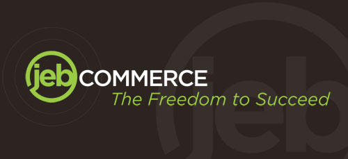
…and the new JEB Commerce logo.
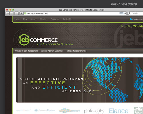
And here is the new identity applied to the new website along with new supporting graphics. WDW also provided design and production for the new JEB Commerce Website and Blog.
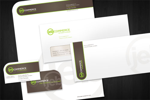
JEB Commerce stationary system.
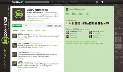
Here’s an example of the identity applied to the Twitter background for JEB Commerce on Twitter.
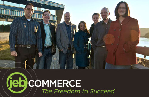
And Whitestone Design Werks also supplied portrait photography for the JEB website and applied the identity to their profile picture for their main Facebook page.
There were many other items that we haven’t included here and a few things that are still in the pipeline, but this should give you an idea of a basic minimum of elements for logo application for any business’ identity system. As you can see, an identity system is more than just a logo.
The bottom-line is that JEB Commerce and Jamie Birch in particular, went from exploring a low-priced, crowd-sourced solution that seemed very affordable, but would have only resulted in an EPS file that they would have then had to have supplied to vendors, web developers and whatever other service providers would have been necessary to produce all the necessary elements.
Like many small businesses just starting out armed with a cheap or free logo file, with the many different vendors responsible for different applications of the logo, along with the varied interpretations of design, would have guaranteed a mish-mash of inconsistent logo application across the board—not to mention the overall poor quality of logo designs that were to be chosen from in the first place. It may have been cheap, but they would have paid dearly in the lost opportunity to shine and gain the respect and trust of both their current and potential clients with a well-crafted identity system—wasting their hard work in building the JEB brand over the past few years.
As a business just starting out, you may not have realized what all was involved and how important your identity was, but now that you are on the cusp of expanding into new territories or getting ready to take your business into the next level of competitiveness and effectiveness, now is the time to seriously consider taking advantage of this time to invest in and re-invent your identity to reflect the new maturity and savvy of your brand. You’re playing with the big-boys now and its time to start looking like it.
For next week, we’ll post some of the other designs explored for the new JEB Commerce identity and hopefully shed a little light on the creation process itself.


Really a nice job, Russell! Very cool to see it all put together. Awesome improvement for them. Great work!
Thanks Ed!