My Take On Starbucks Logo Evolution
Filed under: "Whitestone Design Werks", Design, Identity, Logo Design

In light of Starbucks choosing to update their logo on their cups for their 40th anniversary by streamlining and isolating the mark and ditching the name to join the ranks of iconic brands Nike and Apple. Rather than get angry, I thought I would give it my (tongue firmly in cheek) take on what I think would be the next logical evolution of the iconic brandmark.

Original image from Starbucks
My take on the change as a designer, I think I would have explored a containing ring around the mark, and maybe even tried experimenting with size and orientation (which I would assume was part of their internal process), but I take my hat off to them for making a gutsy decision to take the next step and elevate the brand above being just about “coffee”. I think that removing the concentric ring, takes it out of the crest-style and negates the need to let it stand in isolation. I think they could have had a little more fun with it. But I also understand their desire to not mess too much more with the equity in the existing imagery. Would love to see the stages of exploration that they went through to arrive at their final design.

My take on adding concentric ring outside logo. Just had to see what it would look like
Fellow designers, don’t be too critical of my execution, this was just meant to be a quick, five-minute diversion that like all jobs that take three times longer than planned, turned out to take 15 minutes. So, there are nuances of curves that I would normally take more pains to smooth, etc. Also, the fact that by focusing on just the face, I realize that several other key elements to establishing the iconography are missing, notably the star-crown, hair and mermaidish apparitions of the siren. In hindsight, and if I had the time to indulge, I would have added at least two other steps in the evolutionary chain showing a more gradual reduction. The goal here was getting it to it’s minimal essence—actually, more like past it.
I think I’ll go put another pot of coffee on. And, get back to werk.
JEB Commerce Upcoming Identity Design – Not Just a Logo
Filed under: "Whitestone Design Werks", Design, Identity, Logo Design, North Idaho

After experiencing tremendous growth and unparalleled success as a dynamic start-up in the affiliate marketing management industry, JEB Commerce – Affiliate Program Manangement realized their logo, while professional looking, was more fitting for a business in its infancy than the maturing powerhouse it was becoming and the respected leader in their industry they were aiming to attain. Even as a relatively new player, they had already amassed an impressive client list that included brands like: Elance, Ligonier Ministries, philosphy, OfficeFrog to name just a few as well as successful experience working with brands such as Dean & Deluca and Zappos.com.
After trying an online crowd-sourcing logo design solution and being less-than-impressed with the submissions, JEB Commerce decided to approach Whitestone Design Werks to come up with a design for a new logo in order to refresh and reposition their brand. What Jamie Birch, owner of JEB Commerce thought was a simple request to design a logo, turned into an education about the difference between “just a logo” and what a well-thought out and designed identity system was and how it was crucial for developing JEB Commerce’s position as not just a well-respected brand but an authoritative, leading brand in their space.
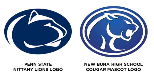
Trademark Infringement of Mascot Logo! Texas High School Gets Mauled by Penn State
Filed under: "Whitestone Design Werks", Design, Identity, Logo Design
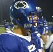
Buna H.S. infringing on Penn State Nittany Lions logo on their helmets
Like many high schools with little budget and no clue as to what institutes true trademark infringement, Buna High School in Buna, Texas had been “assured” by a local sportswear vendor that using this cool cougar image would be perfect and different enough than Penn State’s Nittany Lion logo that they would be safe in using it. Not sure what alternate universe this sportswear vendor was in when they were viewing the Nittany Lions’ logo because it was a rip-off all the way to the same color, but I’m sure they felt some sense of protection in the relative obscurity of being a small high school in the middle of Texas (actually they’re closer to the coast, northeast of Houston) that no one would notice that they were using someone else’s registered trademark for their school mascot. But…someone did, and that someone notified The Collegiate Licensing Company (CLC) in Atlanta, GA, who just happens to manage the licensing of trademarked merchandise for many high-profile NCAA schools and is also charged with enforcing the protection of the trademarked Nittany Lions logo of Penn State in particular. A curt Cease and Desist letter was promptly sent to the small high school with the requirement that they immediately remove the logo from all their uniforms, paint over walls with the logo and stop using the logo for any other printed material or clothing.