Solution For Confusing Names In Car Insurance: AllStateFarmers!
Filed under: "Whitestone Design Werks", Design, Identity, Logo Design
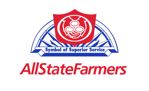
Quick! Who’s your car insurance carrier?! Just thought I would submit a solution to help cement any ongoing confusion you might be having regarding what car insurance brand you currently carry. Probably one of the good reasons GEICO stands out from the crowd. You know if you have GEICO. Allstate? State Farm? Farmers? Not so much.
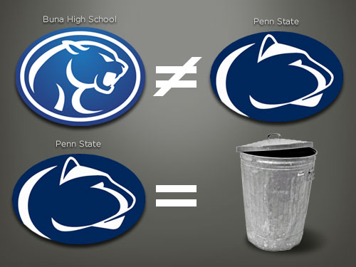
Buna High vs. Penn State: A “Brand” New Equation
The recent scandals that are racking Penn State right now have brought up an interesting dilemma of which Buna High High School no longer has to worry about being associated with (other than this blog post and all the past hoopla over copyright infringement and cease and desists that will remain searchable on the innerwebs). Right now, I would imagine any school or athletic association involving young boys that may have been “inspired” to use the Penn State Nittany Lion logo are now (or should be) scrambling to divest themselves of any connection to this brand. Because the Penn State Nittany Lion as a brand, now represents a tarnished, dare I say, trashed brand that will invoke emotions of outrage and scandal for many years to come.
My Take On Starbucks Logo Evolution
Filed under: "Whitestone Design Werks", Design, Identity, Logo Design
In light of Starbucks choosing to update their logo on their cups for their 40th anniversary by streamlining and isolating the mark and ditching the name to join the ranks of iconic brands Nike and Apple. Rather than get angry, I thought I would give it my (tongue firmly in cheek) take on what I think would be the next logical evolution of the iconic brandmark.

Original image from Starbucks
My take on the change as a designer, I think I would have explored a containing ring around the mark, and maybe even tried experimenting with size and orientation (which I would assume was part of their internal process), but I take my hat off to them for making a gutsy decision to take the next step and elevate the brand above being just about “coffee”. I think that removing the concentric ring, takes it out of the crest-style and negates the need to let it stand in isolation. I think they could have had a little more fun with it. But I also understand their desire to not mess too much more with the equity in the existing imagery. Would love to see the stages of exploration that they went through to arrive at their final design.
Fellow designers, don’t be too critical of my execution, this was just meant to be a quick, five-minute diversion that like all jobs that take three times longer than planned, turned out to take 15 minutes. So, there are nuances of curves that I would normally take more pains to smooth, etc. Also, the fact that by focusing on just the face, I realize that several other key elements to establishing the iconography are missing, notably the star-crown, hair and mermaidish apparitions of the siren. In hindsight, and if I had the time to indulge, I would have added at least two other steps in the evolutionary chain showing a more gradual reduction. The goal here was getting it to it’s minimal essence—actually, more like past it.
I think I’ll go put another pot of coffee on. And, get back to werk.
Design As a Franchise-able Commodity? or, Is a Logo Worth More Than an Inkjet Printer?
Filed under: "Whitestone Design Werks", Design, Logo Design
I recently had a book recommended to me by a friend that has evidently been must-reading for entrepreneurs for years called, The E-Myth Revisited, by Michael E. Gerber. I was aware of the book, but it had never been on my reading list. After my friend flat-out told me that, “You have to read this book” while simultaneously thrusting his well-worn copy into my hands I decided to take him up on his exhortation. While it has more of a Zen influence then I would like, I still found myself quite captivated with all of the business possibilities it stirred up in my mind (and heart). While there were many insightful sections that have stirred me to re-evaluate my own business model, I found myself in a bit of a frustrating quandary. For those who haven’t read the book, I won’t spoil too much (other than they all die in the end) by revealing that much of the business model is based upon developing a franchise-able vision for your company. My quandary was that I could not reconcile my appreciation for the franchise model which relies on developing systems that deliver quantifiable and repeatable, consistent results, with the reality of my business which at its very essence relies on uniqueness, abstract thought, subjective opinion and thinking “outside the box” as it were. How could a design business be modeled as a business that could be franchised?
JEB Commerce Upcoming Identity Design – Not Just a Logo
Filed under: "Whitestone Design Werks", Design, Identity, Logo Design, North Idaho
After experiencing tremendous growth and unparalleled success as a dynamic start-up in the affiliate marketing management industry, JEB Commerce – Affiliate Program Manangement realized their logo, while professional looking, was more fitting for a business in its infancy than the maturing powerhouse it was becoming and the respected leader in their industry they were aiming to attain. Even as a relatively new player, they had already amassed an impressive client list that included brands like: Elance, Ligonier Ministries, philosphy, OfficeFrog to name just a few as well as successful experience working with brands such as Dean & Deluca and Zappos.com.
After trying an online crowd-sourcing logo design solution and being less-than-impressed with the submissions, JEB Commerce decided to approach Whitestone Design Werks to come up with a design for a new logo in order to refresh and reposition their brand. What Jamie Birch, owner of JEB Commerce thought was a simple request to design a logo, turned into an education about the difference between “just a logo” and what a well-thought out and designed identity system was and how it was crucial for developing JEB Commerce’s position as not just a well-respected brand but an authoritative, leading brand in their space.
