Good Article on Fair Use for Copyrighted Work
Filed under: "Whitestone Design Werks", Design
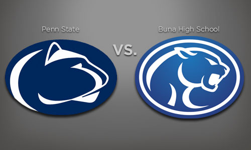
Just came across this article by Steven Heller on AIGA’s site: Rights, Wrongs and the Law: An Interview with Frank Martinez, Esq. for those coming to this site searching for more information of copyright law. While this doesn’t pertain per se to the issue of smaller schools “borrowing” larger school’s better designed and more familiar mascot artwork, it does help to understand the whole concept of what is appropriate to appropriate when the material in question is copyrighted.
The article addresses the increasing challenges that design scholars and historians are having trying to put together books on the history of design when they have to obtain usage rights but are facing increased fees for those rights. If the budget is not there, how will design history be sufficiently documented when they can’t even show what they are writing about.
In a nutshell:
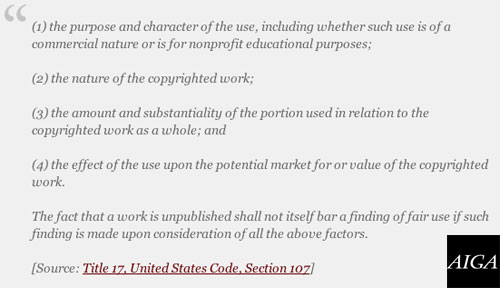
The doctrine of fair use is alive and well. Generally speaking, a use of a copyrighted work will be deemed a fair use when the benefit to the public outweighs the private right of the author or copyright owner. However, it is important to remember that fair use is an exception or defense to the protections embodied in copyright law; fair use is not a right or an absolute shield that creates a general immunization against copyright suitupon invocation by a scholar. The fair use guidelines are arbitrary, they have gained what definition they possess by reason of litigation and they are not embodied in the copyright statute
I encourage you to check out the whole article.
NY Times Article on Colleges vs. High School Logo Trademark Infringement Battles
Filed under: "Whitestone Design Werks", Coeur d'Alene, Design, Identity, Logo Design
Just thought I’d post a quick link to a New York Times article that ran today that outlines the plight of high schools across the country that are facing the legal issues of trademark infringement with the colleges and universities that they have “borrowed” for their own mascot logos. Buna High School and Penn State are mentioned very briefly in passing, but it’s resulted in an increase of searches reaching the original Buna Trademark Infringement article I posted back in June.
Colleges Tell High Schools Logos Are Off Limits
I think the bottom-line is that it’s easy to think of the big schools as the “bullies” picking on these poor little ol’ high schools who just want to have a decent mascot to showcase their school pride, but it highlights the issue of how valuable an identity can be to an organization that has invested resources, both financial and the physical effort of building a winning sports program that elevates the status of that mascot identity and how important it is to protect that investment from being trivialized by overuse by other organizations that haven’t made that same investment.
JEB Commerce Upcoming Identity Design – Not Just a Logo
Filed under: "Whitestone Design Werks", Design, Identity, Logo Design, North Idaho
After experiencing tremendous growth and unparalleled success as a dynamic start-up in the affiliate marketing management industry, JEB Commerce – Affiliate Program Manangement realized their logo, while professional looking, was more fitting for a business in its infancy than the maturing powerhouse it was becoming and the respected leader in their industry they were aiming to attain. Even as a relatively new player, they had already amassed an impressive client list that included brands like: Elance, Ligonier Ministries, philosphy, OfficeFrog to name just a few as well as successful experience working with brands such as Dean & Deluca and Zappos.com.
After trying an online crowd-sourcing logo design solution and being less-than-impressed with the submissions, JEB Commerce decided to approach Whitestone Design Werks to come up with a design for a new logo in order to refresh and reposition their brand. What Jamie Birch, owner of JEB Commerce thought was a simple request to design a logo, turned into an education about the difference between “just a logo” and what a well-thought out and designed identity system was and how it was crucial for developing JEB Commerce’s position as not just a well-respected brand but an authoritative, leading brand in their space.
Trademark Infringement of Mascot Logo! Texas High School Gets Mauled by Penn State
Filed under: "Whitestone Design Werks", Design, Identity, Logo Design
Like many high schools with little budget and no clue as to what institutes true trademark infringement, Buna High School in Buna, Texas had been “assured” by a local sportswear vendor that using this cool cougar image would be perfect and different enough than Penn State’s Nittany Lion logo that they would be safe in using it. Not sure what alternate universe this sportswear vendor was in when they were viewing the Nittany Lions’ logo because it was a rip-off all the way to the same color, but I’m sure they felt some sense of protection in the relative obscurity of being a small high school in the middle of Texas (actually they’re closer to the coast, northeast of Houston) that no one would notice that they were using someone else’s registered trademark for their school mascot. But…someone did, and that someone notified The Collegiate Licensing Company (CLC) in Atlanta, GA, who just happens to manage the licensing of trademarked merchandise for many high-profile NCAA schools and is also charged with enforcing the protection of the trademarked Nittany Lions logo of Penn State in particular. A curt Cease and Desist letter was promptly sent to the small high school with the requirement that they immediately remove the logo from all their uniforms, paint over walls with the logo and stop using the logo for any other printed material or clothing.
MyFonts Beta is Looking Good
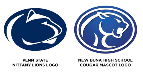
I got a pleasant surprise when I went to MyFonts.com a couple of days ago and saw the new sneak peak at the beta version redesign. What I once thought was my little secret will now be completely out of the bag. No longer will other designers be put off by the almost amateurish appearance of the old site this is replacing. MyFonts was one of those sites whose functionality more than made up for its lack of design sophistication. But I always felt if there was any site that deserved a better site design, MyFonts was it. And now it has one. And it is several orders of magnitude in both the design as well as the functionality.
