JEB Commerce Identity Design and Rebrand Complete
Filed under: "Whitestone Design Werks", Coeur d'Alene, Design, Identity, Logo Design, North Idaho

We’ve been applying the finishing touches on a branding overhaul that Whitestone Design Werks created for JEB Commerce which we announced last September. In that post, our intent (both JEB Commerce and WDW) was to highlight the whole process step by step for the benefit of other businesses considering what it would take to re-invent their identity and infuse their brand with a new fresh, life. Well, the best-laid plans of mice and men…
As a consolation, we are now providing highlights of the new identity system and how it has been applied across the board to all of the collateral pieces needed for conducting a successful business. After showing what was originally being used by JEB Commerce after the jump, we’ll show the new identity living and breathing in all of it’s new environments.
WDWerks.com Redesign Is Live
Filed under: "Whitestone Design Werks", Design, Tech
The new design for WDWerks.com is now live. It actually went live on Tuesday (as I posted last week, I was aiming for Monday), but I was still working on the portfolio pages and getting the slider jquery code to all work properly and just had a scrollable list as an effective placeholder. I was waiting to make any type of formal announcement until that part was ready.
I still have several things to finish on it. In addition to rewriting a lot of the copy (I’m always on the look out for good copywriters!), I will be implementing more jquery effects on the frontpage main image area. I am also working on new CSS for the form on the Contact Us page and will be applying the design to a WordPress theme and launching a dedicated blog for WDWerks. Currently, the blog link directs to this site but that will change soon.
Would enjoy getting anybody’s thoughts or feedback on it. And definitely let me know if you see any problems with it.
Sneak Peak of WDWerks Redesign
My design business website, Whitestone Design Werks, has been suffering from a painfully outdated design and what is even more inexcusable, an embarrassingly outdated portfolio. My cliché excuse is the classic “cobbler’s kids have no shoes” and the fact that I have had plenty of business coming in to keep me more than sufficiently busy–even website design! I haven’t been totally slack. I actually began work on the redesign last December and have sporadically kept plugging away at it and have really been in earnest the past month to finish it up. It is the classic 80% of the time is spent on the last 10% of the work.
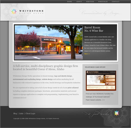
Well, I wanted to whet the appetites of anybody who may have visited the site recently and been disappointed with the lacking portfolio that there are better things to come. So, I thought I would throw a little bone and post a screen shot of the new site as it currently stands. Now I know that someone might think that its easy to post a Photoshop comp of a non-functional site, but you’ll just have to trust me that this is the real deal. My target goal is to get this finished by this weekend and have it up and running by Monday, 11/17. It will also involve moving the site from its current hosting service to Media Temple as well as all the email server configuration, and WordPress setup, etc., so that’s a tall order, but doable.
So, without further ado…


