JEB Commerce Identity Design and Rebrand Complete
Filed under: "Whitestone Design Werks", Coeur d'Alene, Design, Identity, Logo Design, North Idaho
We’ve been applying the finishing touches on a branding overhaul that Whitestone Design Werks created for JEB Commerce which we announced last September. In that post, our intent (both JEB Commerce and WDW) was to highlight the whole process step by step for the benefit of other businesses considering what it would take to re-invent their identity and infuse their brand with a new fresh, life. Well, the best-laid plans of mice and men…
As a consolation, we are now providing highlights of the new identity system and how it has been applied across the board to all of the collateral pieces needed for conducting a successful business. After showing what was originally being used by JEB Commerce after the jump, we’ll show the new identity living and breathing in all of it’s new environments.
Announcing VINeleven at the Napa Valley Marriott
Filed under: "Whitestone Design Werks", Design, Identity, Logo Design
I’m very excited to see the launch of The Napa Valley Marriott’s redesigned lobby and restaurant that they have name VINeleven next week. Whitestone Design Werks is proud to have been chosen to design the new identity that will be used throughout the hotel and restaurant. Their official “Release Party” is an invite affair to be held on Friday, May 6.
Looking forward to getting down there and will posts pics of the logo in the live environment along with a little bit of the story behind the design.
If you get a chance to visit Napa Valley soon, be sure to drop in and enjoy a taste of the fruits of Napa Valley.
My Take On Starbucks Logo Evolution
Filed under: "Whitestone Design Werks", Design, Identity, Logo Design
In light of Starbucks choosing to update their logo on their cups for their 40th anniversary by streamlining and isolating the mark and ditching the name to join the ranks of iconic brands Nike and Apple. Rather than get angry, I thought I would give it my (tongue firmly in cheek) take on what I think would be the next logical evolution of the iconic brandmark.

Original image from Starbucks
My take on the change as a designer, I think I would have explored a containing ring around the mark, and maybe even tried experimenting with size and orientation (which I would assume was part of their internal process), but I take my hat off to them for making a gutsy decision to take the next step and elevate the brand above being just about “coffee”. I think that removing the concentric ring, takes it out of the crest-style and negates the need to let it stand in isolation. I think they could have had a little more fun with it. But I also understand their desire to not mess too much more with the equity in the existing imagery. Would love to see the stages of exploration that they went through to arrive at their final design.
Fellow designers, don’t be too critical of my execution, this was just meant to be a quick, five-minute diversion that like all jobs that take three times longer than planned, turned out to take 15 minutes. So, there are nuances of curves that I would normally take more pains to smooth, etc. Also, the fact that by focusing on just the face, I realize that several other key elements to establishing the iconography are missing, notably the star-crown, hair and mermaidish apparitions of the siren. In hindsight, and if I had the time to indulge, I would have added at least two other steps in the evolutionary chain showing a more gradual reduction. The goal here was getting it to it’s minimal essence—actually, more like past it.
I think I’ll go put another pot of coffee on. And, get back to werk.
Good Article on Fair Use for Copyrighted Work
Filed under: "Whitestone Design Werks", Design
Just came across this article by Steven Heller on AIGA’s site: Rights, Wrongs and the Law: An Interview with Frank Martinez, Esq. for those coming to this site searching for more information of copyright law. While this doesn’t pertain per se to the issue of smaller schools “borrowing” larger school’s better designed and more familiar mascot artwork, it does help to understand the whole concept of what is appropriate to appropriate when the material in question is copyrighted.
The article addresses the increasing challenges that design scholars and historians are having trying to put together books on the history of design when they have to obtain usage rights but are facing increased fees for those rights. If the budget is not there, how will design history be sufficiently documented when they can’t even show what they are writing about.
In a nutshell:
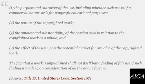
The doctrine of fair use is alive and well. Generally speaking, a use of a copyrighted work will be deemed a fair use when the benefit to the public outweighs the private right of the author or copyright owner. However, it is important to remember that fair use is an exception or defense to the protections embodied in copyright law; fair use is not a right or an absolute shield that creates a general immunization against copyright suitupon invocation by a scholar. The fair use guidelines are arbitrary, they have gained what definition they possess by reason of litigation and they are not embodied in the copyright statute
I encourage you to check out the whole article.
NY Times Article on Colleges vs. High School Logo Trademark Infringement Battles
Filed under: "Whitestone Design Werks", Coeur d'Alene, Design, Identity, Logo Design
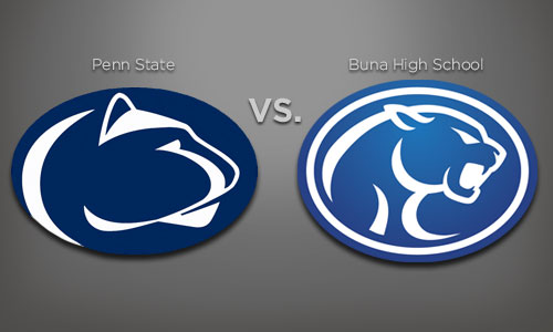
Just thought I’d post a quick link to a New York Times article that ran today that outlines the plight of high schools across the country that are facing the legal issues of trademark infringement with the colleges and universities that they have “borrowed” for their own mascot logos. Buna High School and Penn State are mentioned very briefly in passing, but it’s resulted in an increase of searches reaching the original Buna Trademark Infringement article I posted back in June.
Colleges Tell High Schools Logos Are Off Limits
I think the bottom-line is that it’s easy to think of the big schools as the “bullies” picking on these poor little ol’ high schools who just want to have a decent mascot to showcase their school pride, but it highlights the issue of how valuable an identity can be to an organization that has invested resources, both financial and the physical effort of building a winning sports program that elevates the status of that mascot identity and how important it is to protect that investment from being trivialized by overuse by other organizations that haven’t made that same investment.

